7 Reasons Why You Should Use Responsive Web Design
27 May 2020
by Lotte, Digital Content Specialist
27 May 2020
by Lotte, Digital Content Specialist
7 Reasons Why You Should Use Responsive Web Design
Table of contents
Contact us
We will get back to you in the next 48 hours.

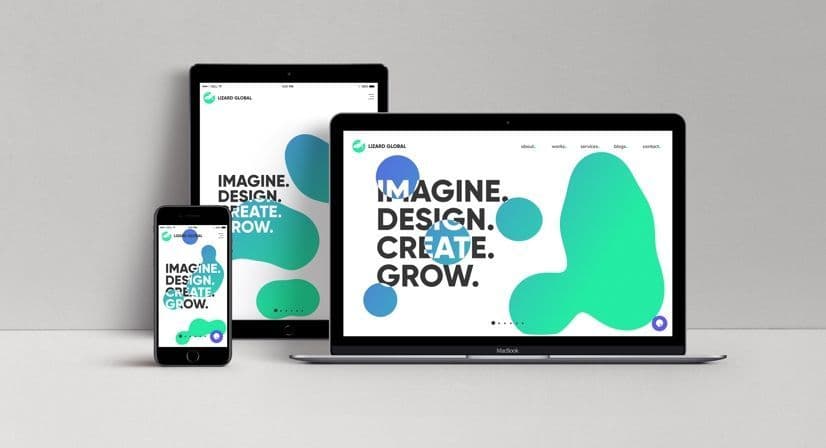
A responsive design for your website can give your overall user experience and web traffic an immense boost.
A good design for your website can be a true game changer for your business. It can greatly improve the overall user experience, which results in more web traffic and possibly more leads. One way to optimize the experience of your website is by responsive web design, which makes sure the interface of your website adjusts itself to any type of device or screen.
Why you should make your website responsive
A responsive web design is built in such a way that it automatically scales its interface based on the device or screen you’re using. Now that there’s a continuous stream of innovations in technological devices, there are a lot of screen sizes and resolutions to consider when designing a website. In order to save yourself a lot of time and effort you’d normally invest in designing a separate interface for all different screens, it’s a good idea to go for one single responsive design that does the rest of the work for you. Here’s a list of reasons to implement a responsive design next time you build a website, in case you’re not convinced yet:
1. No boundaries regarding devices and screens
As should be obvious by now, a responsive design eliminates all boundaries regarding the devices and screens your website can be accessed on. And it doesn’t only give access to all screens, it also provides the best possible user experience on these platforms: There’s no zooming or horizontal scrolling needed. Your interface automatically reforms in such a way that your visitors can still easily read the content and enjoy the overall experience. If, for some reason, one of your visitors doesn’t possess a desktop or smartphone, but only a Smart Watch, it doesn’t hold them back from visiting your website and reading your content. Next to that, you don’t have to create a design for all different types of screens and devices. One design, adaptable to any size.
2. Your website on more devices = more overall traffic
The fact that your website is widely accessible, also heightens the likelihood that there’s more overall traffic. The fewer devices your site is accessible on, the smaller your audience, and thus less web traffic. Imagine your readers waiting for the train, with only a phone on hand. They come across one of your blog articles. Fortunately, you’ve made sure your website is responsive, so they can easily access and read it while waiting. If your site wouldn’t have a responsive design, they would have probably skipped this blog at that moment.
3. Analyzing your web traffic in one place
Because your website has one responsive interface, it means that all your web traffic is gathered in one place, no matter from what device it comes through. In your web traffic analytics you can see from what devices your audience is visiting your website, but you don’t need multiple dashboards for your analytics, based on all different devices. This keeps all your data structured and in one place. Or in other words, less work for you.
4. Lower maintenance & costs
Speaking of less work, a responsive design also goes hand in hand with lower maintenance, and therefore, lower costs. Any adjustments in layout can be done for one single interface. The responsiveness of the design automatically adjusts these adaptations for all screen sizes.
5. A Consistent design improves the overall user experience
Having one single design, smoothly changing along with the change of screen sizes, guarantees a consistent experience of the interface, and therefore improves the overall user experience. And a pleasant user experience makes it more likely that your audience will return or tell others about their pleasant experience. In other words, a consistent design and experience can greatly improve your overall traffic in visitors.
6. Improved SEO score and Google Search Ranking
SEO, or Search engine optimization is a specific strategy used to give websites a boost in Google’s search page rankings. The higher your website appears in Google’s search engine, the higher the chance potential customers will notice your website and visit it. Generally, Google gives a preference to websites that are mobile friendly, which is why a responsive design can greatly contribute to your overall ranking.
7. Staying ahead of your competitors
There are still a lot of companies that don’t make use of the benefits of a responsive design, which means that this is a perfect opportunity to stay ahead of your competitors. In a sense, a high-quality responsive website functions as your business card. It has to stand out from the crowd in order to make potential customers interested in knowing more about your business.
Implementing responsive design: the basics
There are quite some factors to consider when creating a responsive layout for your website. It’s a design process that asks for a clear system and hierarchy of content across different devices. Generally, there are three main components included in the process towards a responsive web design. Let’s quickly go through these terms and definitions:
- A fluid Grid
- Media queries
- Flexible written and visual content
A fluid grid is a crucial part of a responsive web design. A non-responsive web design possesses grids with fixed dimensions. Fluid grids, on the other hand, ensure that a design is flexible and scalable. The elements within the design have consistent proportions, and can be adjusted to any kind of screen dimensions.
Media queries are pieces of code that impact the flexibility of a layout on a responsive website. They control the CSS (stylesheet) and make sure it’s applied according to the screen it’s displayed on and the device’s dimensions. Media queries allow multiple ways to display a design, all with the same HTML code.
Having flexible text and images makes sure that content is readable and of consistent quality on any kind of device. The content hierarchy that’s set within the CSS code decides how written content resizes depending on the screen size. Images can be set to scale, crop, or simply disappear depending on the device it’s watched on.
Some things to consider
A responsive design does not miraculously solve all your problems regarding the attraction of an audience. Here are some things to consider when designing a responsive interface for your website:
- A responsive design possesses the same functionalities on all kinds of devices and screens. However, not all of these functionalities are useful on every device. Mobile users might have different needs than desktop users, which can make responsive design unsuitable for your goals.
- In case your website implements third-party advertisements, this can be an issue regarding the changing interface on different screens. Responsive designs can cause problems with resized advertisements or banner ads, which is something you might want to keep in mind when designing your website.
- Implementing a responsive design for your website isn’t a piece of cake. If you have a limited knowledge or skill set for web design -or none at all- you might have to search for an external party to do the job for you.
We can help!
At Lizard Global, we are experienced with responsive web design. Not only is our own web interface fully responsive, we’ve also helped a lot of clients with their responsive designs. Need a hand in the design of your website? Don’t hesitate to get in touch with us, and we see what we can do for you and your business.


Stuck between a great idea and the right team to build it?Let's talk.
We work with corporate innovation teams and ambitious scale-ups across the Netherlands, Singapore, and Australia, and wherever great software needs to be built. Drop us a message and we'll get back to you within one business day.


Markus Monnikendam
Global Commercial Director
hello@lizard.global