digital agency
innovation
+ 4 more ...
Rebranding Lizard Global: How a New Design Can Boost Your Brand
28 Oct 2020
by Lotte, Digital Content Specialist
28 Oct 2020
by Lotte, Digital Content Specialist
digital agency
innovation
growth
branding
identity
business
Rebranding Lizard Global: How a New Design Can Boost Your Brand
Table of contents
Contact us
We will get back to you in the next 48 hours.

At Lizard Global, we like to stay on top of our game, which is why we are continuously changing and improving.
To sit still is to go backwards. This is a phrase which we at Lizard Global take to heart. We are always on the lookout for new emerging technologies, techniques, and game changers. In this ever-changing spectrum, we find it important to keep a critical eye on the products and services we deliver. It is an understatement to say that the technological and digital fields are the fastest moving industries. If you rest your laurels, grow complacent and stop innovating, you get left behind in the dust and will struggle to catch up. Others won’t wait for you and we certainly aren’t waiting either.
At Lizard Global we are always refining our way of working, finding new channels, staying up to date with the market and setting new standards in certain regions. Our reputation is a testament to our mission to add value continuously.
“A body at rest tends to stay at rest. A body in motion tends to stay in motion.” – Isaac Newton
One product that most companies tend to forget about is their own website. In this digital world, the website is one of the most highly visible and important sales funnels of a company; it is the business card of the modern world. Therefore, it is important that the website tells the right story and gives a good introduction of the services the company delivers as well as their values. That is no different at Lizard Global. We want to show our visitors and potential clients what we do, including our core company values, so they know exactly what to expect from a partnership with Lizard Global.
Growth is a continuous process. It is a journey without an end - but should always have a clear direction. At Lizard Global, we understand that time passes fast, technology keeps revolutionizing itself every single day, and we need to stay at the forefront of emerging technologies and processes. Just as software needs to constantly update itself in order to meet the needs of its users, businesses and their ‘brand identity need to go through the exact same process. Luckily, as an experienced digital agency, we’re quite used to this fast-paced way of working and evolving. For the past few weeks, we have paved the way towards a new identity: Lizard Global 2.0.
Data-driven decisions
During the past year, we’ve challenged ourselves as a team to generate more physical and digital commercial impulses, which caused a significant boost to our web traffic and led to new insights into our metrics on Google Analytics. As a business, you don’t analyze your metrics just to see your audience growing; you measure this data in order to define strategies based upon these metrics, turn this data into KPIs, and formulate actionable methods for growth. This continuous cycle of measurement and action is exactly what Lean Analytics is all about. During the process of working towards Lizard Global 2.0, we’ve mainly focused on the following key metrics:
- Total visitors
- Unique visitors
- New visitors
- Clickthrough rate
- Bounce rate
- Session duration
- Number of new leads
By following these metrics closely, we knew exactly what elements on our website were ready for a refresh. That said, it wasn't only metrics we were focusing on. After all, the most precise, reliable, and honest feedback comes from visitors themselves. Our commercial director Markus and technical team lead/solutions consultant Chathuri gathered feedback from clients during meetings. We obtained the qualitative data we lacked through analytics, incremental website updates, surveys, and networking. This data was taken into account during the planning and execution of our website revision. After all, we don’t just want to get the best results out of our website, we also highly prize the experience of our customers when they visit our site.
What did we change?
During the process of redesigning the UI/UX design of our website, we focused on specific elements and features that could benefit most from a redesign, and therefore deserved a priority position. On the design side of things, our UI/UX designer Eric used the in-house design system to conceptualize the strategy and gave it a fresh coat of paint to ensure it’s aligned with current design trends. As mentioned before, we’ve been closely tracking and analyzing our web traffic. This data showed us exactly where changes were needed in order to generate more clicks and activity, and eventually more leads.
About us
Because Lizard Global possesses a unique international and multicultural character, we decided that this deserves to be specifically highlighted on our website. Our renewed about page gives you a deeper insight into the culture at Lizard Global, and how a small startup turned into a close-knit Lizard Family over time, where colleagues are friends who challenge each other’s strengths and complement each other’s imperfections.

CTAs for Lead Generation
During the process towards Lizard Global 2.0, we’ve been diving into the most essential metrics of our website. By doing this, we found out that there were still quite some functionalities we could optimize to positively impact the overall user experience of our customers, and thereby the most essential metrics affecting the growth of our company. We’ve noticed that obvious and attractive Call To Actions (CTAs) on our website have a positive impact on our web traffic and short and long-term lead generation, which is why we focused on the implementation of more opportunities for our visitors to get in contact with us. This way, our commercial team can help our customers in the best way possible.

Landing page
We’ve been tracking the retention rate of visitors on our website, and found that our landing page had some troubles with catching and holding the interest of our audience. Whereas our previous landing page was still built upon different pages users could slide through, our new current page consists of one static page where our visitors can find all the information they need in order to get to know Lizard Global. After all, your website is your digital business card, and your landing page is the first thing visitors see when they access your site. Because of that, the first page needs to showcase exactly all you have to offer, without a user having to search your entire website for answers. Because we’ve been facing some questions from our visitors about the meaning of our slogan “IMAGINE, DESIGN, CREATE, GROW”, our homepage now also dives deeper into our definitions of these terms.
Client reviews
For the past few years, Lizard Global has been thriving, and our team has managed to help a broad range of clients with their digital solutions. From UI/UX design to technical development, we’ve done it all. Since we’re very proud of what we’ve accomplished, we wanted to let our clients speak for us. The new website has reserved a special place for our project partners and their testimonials.
Blogs
During the past year, our content creators have been working on a broad collection of authentic Lizard Global blogs. From topics about customer acquisition, agile methodologies, design thinking, automation, and artificial intelligence to Lizard Global services and the “Meet the Lizards” interview series, it’s all there. In the time-span of a year, we’ve written an astonishing number of blogs - almost 75! A collection like this deserves a place in the spotlight, which is why you can now also access our blogs directly from our landing page. Aside from a new spot on our landing page, our blogs will start to dive deeper into the experience of Lizard Global as your digital partner. The contents of our blogs will be filled more with the input of our experts within the Lizard Family, offering users more engaging content and a look inside the company itself.
Our Projects
Besides our blogs, the previous projects with our partners also deserve a place on the home page. We have worked hard over the years to grow the list of successful projects and want to highlight them on our website. Additionally, it was time to revamped some of the older business success cases of Ebol, SkyEcho, and Tracker Apps with new information. Stay tuned, because from now on we will introduce brand new success stories on our website on a bi-weekly basis.
Our process
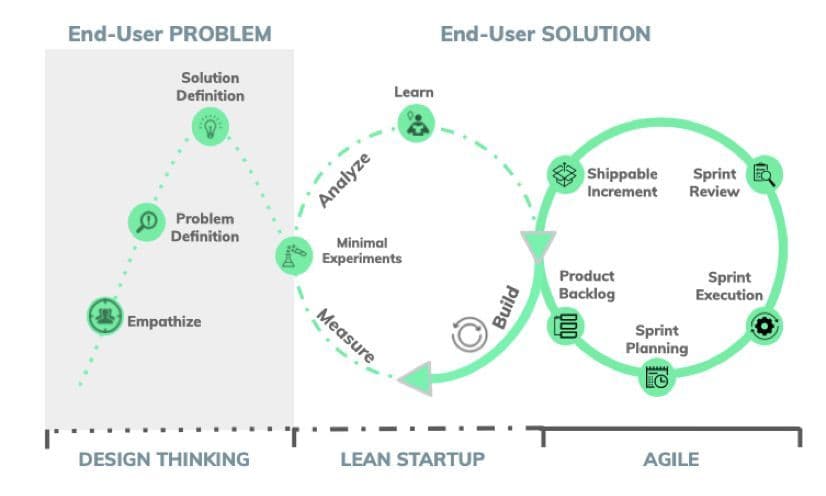
Because we follow the continuous road towards growth, we didn’t just make the leap from Lizard Global 1.0 to Lizard Global 2.0. On the contrary, we’ve been defining, implementing, measuring, and adapting every step along the way, from version 1.1, 1.2, 1.3, all the way to where we are now: Lizard Global 2.0. And even now, we’re still moving forwards towards 2.1, 2.2, 2.3, and so forth. Through constant tracking of analytics and interviews with end-users, we’ve been going through the agile cycle of feedback and deployment. This process will guide us to future improvements as well. We add value continuously, for ourselves, but especially for our clients.
Design Thinking
All our processes focused on growth are built upon the principles of Design Thinking. Using this human-centered approach, we dive deeper into the minds of our end-users in order to find out what problems we need to solve, and how we can create digital solutions that are perfectly aligned with the needs of our customers. Design Thinking focuses on the practice of empathizing with your end-users. Only by creating a deeper understanding of how your customers think and behave, you can create solutions that fit their needs.
Using the Design Thinking principles at Lizard Global, we found out that some of our potential customers didn’t really have a clear understanding of what we do as a digital agency when visiting our website. They had to actively look for a clear description of our services and the explanation of our slogan: Imagine, Design, Create, Grow. This stimulated us to actively put ourselves in our customers’ shoes, see how they view our website as visitors, and find out what we, as a brand, can do to make sure our users understand our business and the services we offer.
Agile Scrum Methodologies
At Lizard Global, we work Agile. This means that we focus on optimizing the efficiency of our business processes in such a way that all steps within the process are streamlined and smooth. We do this by the means of Scrum methodologies, among which the use of sprints. This way, our entire team, including the client, will be well informed about the process every step of the way. Because the design and development of our new website is an internal project, we are able to use our expertise and creativity to continuously implement new experimental features. During the implementation, we work following our Agile approach, using UI/UX sprints to transform the solutions we came up with into designed screens.
The stakeholders -in this case the management team- had to review the designed screens to make sure that it met their expectations, which happens following the refined and agile practice of the scrum methodology. During the development phase we had daily calls/meetings to update each other on our progress and challenges to ensure we finish the tasks within the timeline we’ve set. By the end of the sprint, we held a Sprint Review meeting, during which we reviewed every task completed and planned ahead for the next sprint(s). By doing that, we ensured that everyone had a clear idea of what was completed and could provide feedback if needed.
Challenges
Because the revamp of our website was an internal project, it allowed us more room for experimentation. And we got a tremendous amount of options and possibilities from our internal team. The challenge was picking the right experiments and solutions that fit the problems of the end user. Our design and development team could showcase their skills, get everything out of the closet, and use some unconventional and experimental design approaches. Because we had so many options to pick from, all with their own unique strengths and specialties, we developed more potential solutions in the form of wireframes and mockups than we usually do, and we had to decide which one of the solutions would be the best option for us.
Since the Lizard Family consists of an astonishing amount of 35 inspiring professionals, with each their own ideal vision of the new website, it was a challenge to find solutions everyone stands behind. Following our scrum methodology, we made sure that everyone was informed and up-to-date about changes and implementations at all times. By doing this, everyone had the chance to share their own thoughts on the new design. Eventually, our new website is built upon a combination of all inspiring ideas and the individual expertise of our Lizards.
Need a hand?
Are you considering a revamp of your own brand, but are you not sure where to start? We gladly partner up with you and walk the road towards growth together. Or do you want to do much more than just a revised design of your business? Get in touch with us, because we’d like to hear all about your innovative ideas. Together, we dive into the ins and outs of your business and find out how we can create a cutting-edge digital solution to take your business to the next level. Curious how we do this? Check out our digital brochure to find out more about our services and methodologies. And while you’re at it, take a look at our portfolio to find out all about our verticals and projects we’ve finalized so far.
Are you an innovative intrapreneur and entrepreneur with a great plan for an application? And are you ready to start a partnership with Lizard Global to turn your ideas into reality? Don’t hesitate to get in touch with us! You can reach us with a phone call, by email, WhatsApp, via our chatbox, or by scheduling a meeting with the comfort of a cup of coffee on the side. We look forward to meeting you and starting our digital journey together!

At Lizard Global, we like to stay on top of our game, which is why we are continuously changing and improving.
To sit still is to go backwards. This is a phrase which we at Lizard Global take to heart. We are always on the lookout for new emerging technologies, techniques, and game changers. In this ever-changing spectrum, we find it important to keep a critical eye on the products and services we deliver. It is an understatement to say that the technological and digital fields are the fastest moving industries. If you rest your laurels, grow complacent and stop innovating, you get left behind in the dust and will struggle to catch up. Others won’t wait for you and we certainly aren’t waiting either.
At Lizard Global we are always refining our way of working, finding new channels, staying up to date with the market and setting new standards in certain regions. Our reputation is a testament to our mission to add value continuously.
“A body at rest tends to stay at rest. A body in motion tends to stay in motion.” – Isaac Newton
One product that most companies tend to forget about is their own website. In this digital world, the website is one of the most highly visible and important sales funnels of a company; it is the business card of the modern world. Therefore, it is important that the website tells the right story and gives a good introduction of the services the company delivers as well as their values. That is no different at Lizard Global. We want to show our visitors and potential clients what we do, including our core company values, so they know exactly what to expect from a partnership with Lizard Global.
Growth is a continuous process. It is a journey without an end - but should always have a clear direction. At Lizard Global, we understand that time passes fast, technology keeps revolutionizing itself every single day, and we need to stay at the forefront of emerging technologies and processes. Just as software needs to constantly update itself in order to meet the needs of its users, businesses and their ‘brand identity need to go through the exact same process. Luckily, as an experienced digital agency, we’re quite used to this fast-paced way of working and evolving. For the past few weeks, we have paved the way towards a new identity: Lizard Global 2.0.
Data-driven decisions
During the past year, we’ve challenged ourselves as a team to generate more physical and digital commercial impulses, which caused a significant boost to our web traffic and led to new insights into our metrics on Google Analytics. As a business, you don’t analyze your metrics just to see your audience growing; you measure this data in order to define strategies based upon these metrics, turn this data into KPIs, and formulate actionable methods for growth. This continuous cycle of measurement and action is exactly what Lean Analytics is all about. During the process of working towards Lizard Global 2.0, we’ve mainly focused on the following key metrics:
- Total visitors
- Unique visitors
- New visitors
- Clickthrough rate
- Bounce rate
- Session duration
- Number of new leads
By following these metrics closely, we knew exactly what elements on our website were ready for a refresh. That said, it wasn't only metrics we were focusing on. After all, the most precise, reliable, and honest feedback comes from visitors themselves. Our commercial director Markus and technical team lead/solutions consultant Chathuri gathered feedback from clients during meetings. We obtained the qualitative data we lacked through analytics, incremental website updates, surveys, and networking. This data was taken into account during the planning and execution of our website revision. After all, we don’t just want to get the best results out of our website, we also highly prize the experience of our customers when they visit our site.
What did we change?
During the process of redesigning the UI/UX design of our website, we focused on specific elements and features that could benefit most from a redesign, and therefore deserved a priority position. On the design side of things, our UI/UX designer Eric used the in-house design system to conceptualize the strategy and gave it a fresh coat of paint to ensure it’s aligned with current design trends. As mentioned before, we’ve been closely tracking and analyzing our web traffic. This data showed us exactly where changes were needed in order to generate more clicks and activity, and eventually more leads.
About us
Because Lizard Global possesses a unique international and multicultural character, we decided that this deserves to be specifically highlighted on our website. Our renewed about page gives you a deeper insight into the culture at Lizard Global, and how a small startup turned into a close-knit Lizard Family over time, where colleagues are friends who challenge each other’s strengths and complement each other’s imperfections.

CTAs for Lead Generation
During the process towards Lizard Global 2.0, we’ve been diving into the most essential metrics of our website. By doing this, we found out that there were still quite some functionalities we could optimize to positively impact the overall user experience of our customers, and thereby the most essential metrics affecting the growth of our company. We’ve noticed that obvious and attractive Call To Actions (CTAs) on our website have a positive impact on our web traffic and short and long-term lead generation, which is why we focused on the implementation of more opportunities for our visitors to get in contact with us. This way, our commercial team can help our customers in the best way possible.

Landing page
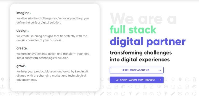
We’ve been tracking the retention rate of visitors on our website, and found that our landing page had some troubles with catching and holding the interest of our audience. Whereas our previous landing page was still built upon different pages users could slide through, our new current page consists of one static page where our visitors can find all the information they need in order to get to know Lizard Global. After all, your website is your digital business card, and your landing page is the first thing visitors see when they access your site. Because of that, the first page needs to showcase exactly all you have to offer, without a user having to search your entire website for answers. Because we’ve been facing some questions from our visitors about the meaning of our slogan “IMAGINE, DESIGN, CREATE, GROW”, our homepage now also dives deeper into our definitions of these terms.

Client reviews
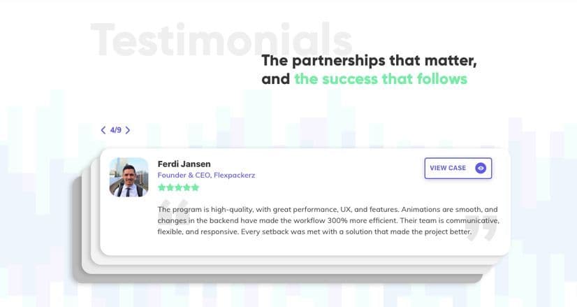
For the past few years, Lizard Global has been thriving, and our team has managed to help a broad range of clients with their digital solutions. From UI/UX design to technical development, we’ve done it all. Since we’re very proud of what we’ve accomplished, we wanted to let our clients speak for us. The new website has reserved a special place for our project partners and their testimonials.

Blogs
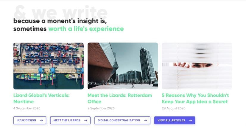
During the past year, our content creators have been working on a broad collection of authentic Lizard Global blogs. From topics about customer acquisition, agile methodologies, design thinking, automation, and artificial intelligence to Lizard Global services and the “Meet the Lizards” interview series, it’s all there. In the time-span of a year, we’ve written an astonishing number of blogs - almost 75! A collection like this deserves a place in the spotlight, which is why you can now also access our blogs directly from our landing page. Aside from a new spot on our landing page, our blogs will start to dive deeper into the experience of Lizard Global as your digital partner. The contents of our blogs will be filled more with the input of our experts within the Lizard Family, offering users more engaging content and a look inside the company itself.

Our Projects
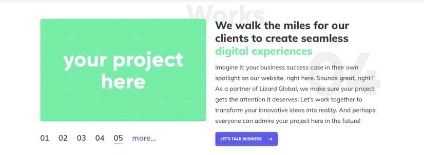
Besides our blogs, the previous projects with our partners also deserve a place on the home page. We have worked hard over the years to grow the list of successful projects and want to highlight them on our website. Additionally, it was time to revamped some of the older business success cases of Ebol, SkyEcho, and Tracker Apps with new information. Stay tuned, because from now on we will introduce brand new success stories on our website on a bi-weekly basis.

Our process
Because we follow the continuous road towards growth, we didn’t just make the leap from Lizard Global 1.0 to Lizard Global 2.0. On the contrary, we’ve been defining, implementing, measuring, and adapting every step along the way, from version 1.1, 1.2, 1.3, all the way to where we are now: Lizard Global 2.0. And even now, we’re still moving forwards towards 2.1, 2.2, 2.3, and so forth. Through constant tracking of analytics and interviews with end-users, we’ve been going through the agile cycle of feedback and deployment. This process will guide us to future improvements as well. We add value continuously, for ourselves, but especially for our clients.
Design Thinking
All our processes focused on growth are built upon the principles of Design Thinking. Using this human-centered approach, we dive deeper into the minds of our end-users in order to find out what problems we need to solve, and how we can create digital solutions that are perfectly aligned with the needs of our customers. Design Thinking focuses on the practice of empathizing with your end-users. Only by creating a deeper understanding of how your customers think and behave, you can create solutions that fit their needs.
Using the Design Thinking principles at Lizard Global, we found out that some of our potential customers didn’t really have a clear understanding of what we do as a digital agency when visiting our website. They had to actively look for a clear description of our services and the explanation of our slogan: Imagine, Design, Create, Grow. This stimulated us to actively put ourselves in our customers’ shoes, see how they view our website as visitors, and find out what we, as a brand, can do to make sure our users understand our business and the services we offer.
Agile Scrum Methodologies
At Lizard Global, we work Agile. This means that we focus on optimizing the efficiency of our business processes in such a way that all steps within the process are streamlined and smooth. We do this by the means of Scrum methodologies, among which the use of sprints. This way, our entire team, including the client, will be well informed about the process every step of the way. Because the design and development of our new website is an internal project, we are able to use our expertise and creativity to continuously implement new experimental features. During the implementation, we work following our Agile approach, using UI/UX sprints to transform the solutions we came up with into designed screens.
The stakeholders -in this case the management team- had to review the designed screens to make sure that it met their expectations, which happens following the refined and agile practice of the scrum methodology. During the development phase we had daily calls/meetings to update each other on our progress and challenges to ensure we finish the tasks within the timeline we’ve set. By the end of the sprint, we held a Sprint Review meeting, during which we reviewed every task completed and planned ahead for the next sprint(s). By doing that, we ensured that everyone had a clear idea of what was completed and could provide feedback if needed.

Challenges
Because the revamp of our website was an internal project, it allowed us more room for experimentation. And we got a tremendous amount of options and possibilities from our internal team. The challenge was picking the right experiments and solutions that fit the problems of the end user. Our design and development team could showcase their skills, get everything out of the closet, and use some unconventional and experimental design approaches. Because we had so many options to pick from, all with their own unique strengths and specialties, we developed more potential solutions in the form of wireframes and mockups than we usually do, and we had to decide which one of the solutions would be the best option for us.
Since the Lizard Family consists of an astonishing amount of 35 inspiring professionals, with each their own ideal vision of the new website, it was a challenge to find solutions everyone stands behind. Following our scrum methodology, we made sure that everyone was informed and up-to-date about changes and implementations at all times. By doing this, everyone had the chance to share their own thoughts on the new design. Eventually, our new website is built upon a combination of all inspiring ideas and the individual expertise of our Lizards.
Need a hand?
Are you considering a revamp of your own brand, but are you not sure where to start? We gladly partner up with you and walk the road towards growth together. Or do you want to do much more than just a revised design of your business? Get in touch with us, because we’d like to hear all about your innovative ideas. Together, we dive into the ins and outs of your business and find out how we can create a cutting-edge digital solution to take your business to the next level. Curious how we do this? Check out our digital brochure to find out more about our services and methodologies. And while you’re at it, take a look at our portfolio to find out all about our verticals and projects we’ve finalized so far.
Are you an innovative intrapreneur and entrepreneur with a great plan for an application? And are you ready to start a partnership with Lizard Global to turn your ideas into reality? Don’t hesitate to get in touch with us! You can reach us with a phone call, by email, WhatsApp, via our chatbox, or by scheduling a meeting with the comfort of a cup of coffee on the side. We look forward to meeting you and starting our digital journey together!
similar reads


