Technical Challenges in Developing for the Blind and Visually Impaired: Insights and Lessons Learned
Get the latest updates about our blog posts.
Subscribe so you don’t miss out!
Key Takeaways
- Diversity in Visual Impairment Requires Flexible Solutions: Designing for blind and partially sighted users demands adaptable approaches that cater to various accessibility needs.
- Accessibility Standards Are Essential: WCAG and W3C guidelines provide a solid foundation for creating accessible products, even for teams without formal accessibility training.
- Tools and Simulations Bridge the Gap: Figma plugins, screen reader testing, and accessibility simulators help validate designs and ensure they meet real-world usability requirements.
- Collaboration Builds Success: Close communication between designers, developers, and clients ensures alignment, trust, and a better end product.
- Accessibility Enhances Overall Usability: Solutions designed for accessibility often improve the user experience for everyone, demonstrating the value of inclusivity in technology.
Creating accessible technology for blind and visually impaired users isn’t just about following guidelines—it’s about solving unique, often unpredictable and overlooked challenges at the intersection of design, development, and user experience. The complexities lie in accommodating a spectrum of visual impairments, meeting precise accessibility standards, and adapting to assistive technologies like screen readers.
The Lizard Global development team tasked with transforming a traditional manual-based program into a fully accessible digital platform - My New Behavior - shared a behind-the-scenes look at the challenges they faced—and the innovative solutions they discovered along the way.
The Challenge of Varying Levels of Visual Impairment
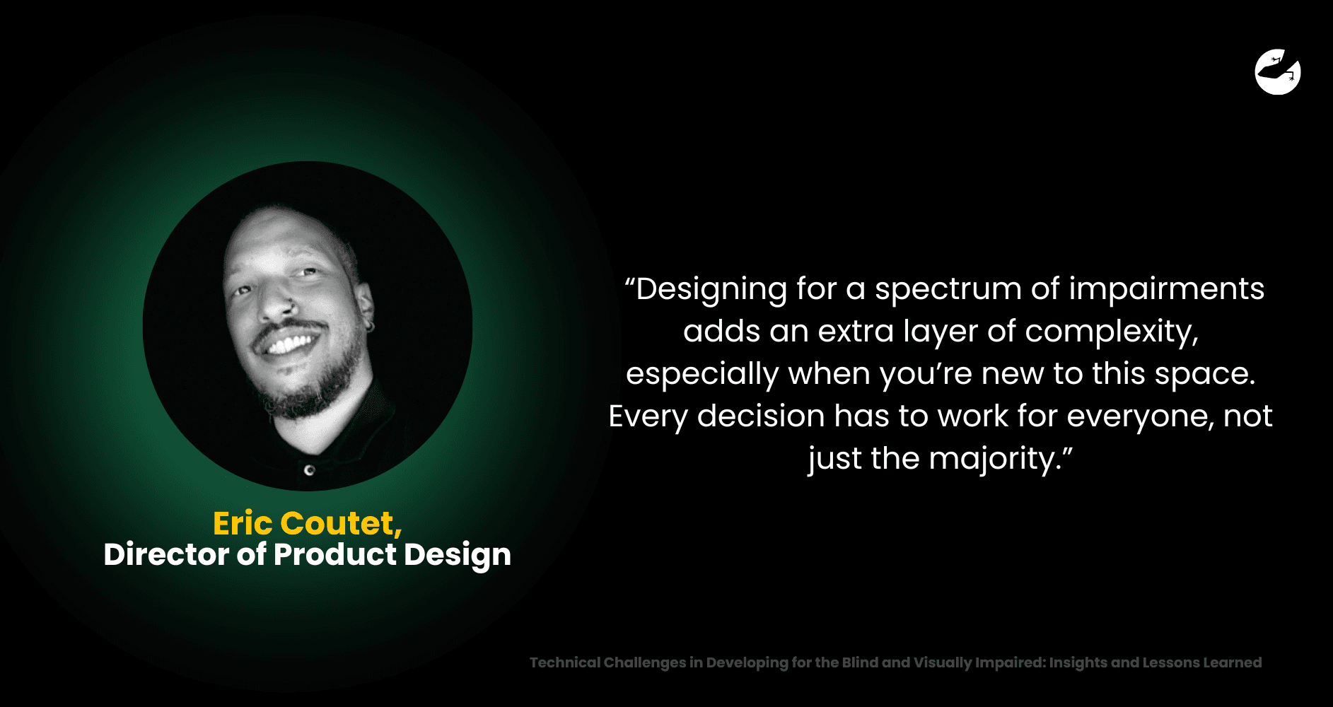
One of the first hurdles the team encountered was understanding and designing for the diverse needs of visually impaired users. While some users might have partial sight and rely on high-contrast visuals or enlarged text, others are completely blind and depend entirely on assistive technologies like screen readers.
“It’s not one-size-fits-all,” Eric, who spearheaded the design process, explained. “Designing for a spectrum of impairments adds an extra layer of complexity, especially when you’re new to this space. Every decision has to work for everyone, not just the majority.”
This challenge was compounded by the project’s scope: digitizing a multifaceted teaching program originally delivered in person. The program involved teaching concepts, questioning users, and guiding them through practical applications. Translating these elements into a fully digital experience required reimagining how users interact with the content without human guidance.
The Learning Curve: Acquiring Accessibility Expertise
The whole journey began with the design team turning to self-directed learning, diving into resources like Web Content Accessibility Guidelines (WCAG) and W3C standards, often called the gold standards of digital accessibility. These comprehensive frameworks acted as their north star, laying out everything from contrast ratios to keyboard navigation. But textbook knowledge wasn’t enough. The design team turned to online courses, blogs, and videos to deepen their understanding.
Design tools like Figma became their experimental ground. With its suite of accessibility plugins, Figma helped them test color contrast, font legibility, and layout design. “Learning about accessibility is more than a skill—it’s a mindset,” Eric said. “Even if a project doesn’t explicitly require accessibility, it’s something we now incorporate at a subconscious level.”
What began as an unfamiliar challenge soon became an invaluable skill set. The team found that the more they learned about accessibility, the more natural it became to incorporate these principles into their day-to-day work.
From Principles to Practicality: Challenges While Designing For The Visually Impaired
Designing for accessibility is about more than ticking boxes—it’s about creating a seamless, intuitive experience for all users, including those who interact with technology differently.
The team quickly discovered that traditional design principles often fall short when applied to accessibility. For example, relying on visual cues like color or icons to guide users won’t work for someone using a screen reader. They had to rethink how users navigate, interact with, and process information on the platform.
Want to find out how much it costs to build your dream app or web app?
One major challenge was creating focus management systems—ensuring that when a user opens a form or modal, their attention is directed to the right place. Imagine opening a dropdown menu and finding your cursor lost in a random section of the page—that’s what visually impaired users face without well-structured focus management.
Another hurdle was linear navigation for screen readers. Instead of building visually striking layouts, the team needed to construct pages that would make logical sense when read out loud in a linear, step-by-step manner. Tools like accessibility simulators allowed them to see their designs through the eyes—and ears—of visually impaired users, helping them catch pitfalls early.
Here’s what the design team learned:
1. Testing and Validation
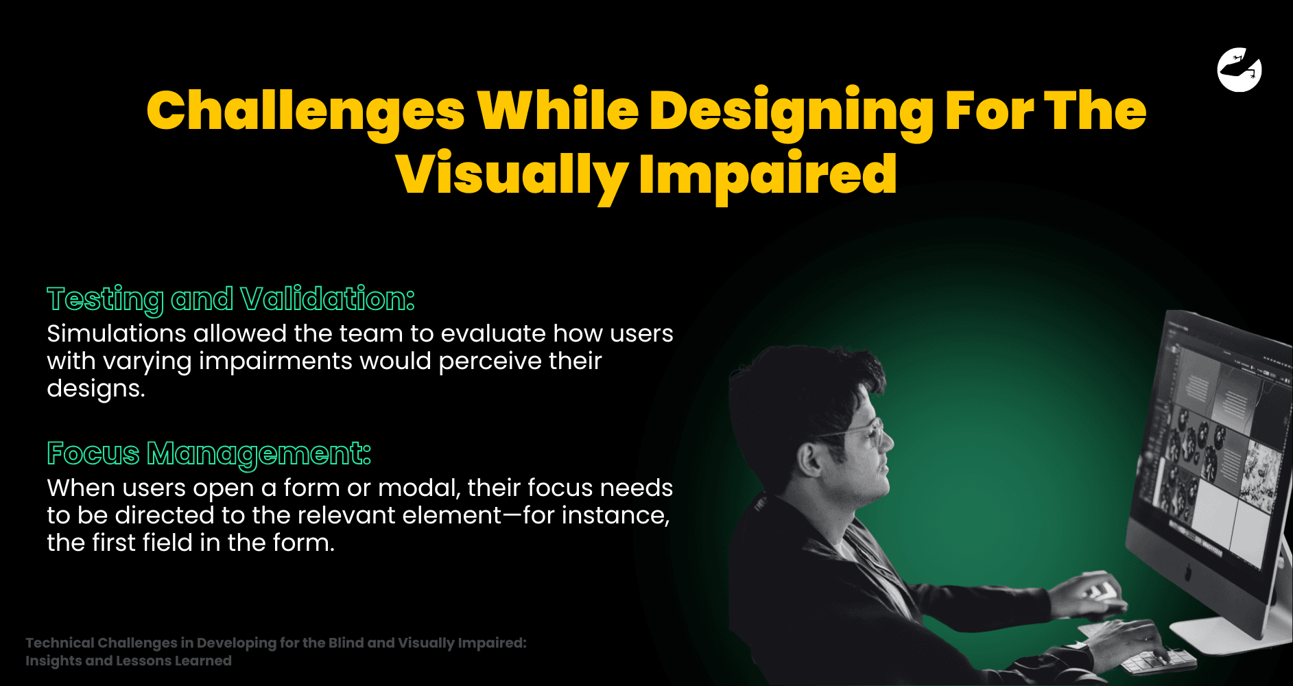
Testing with accessibility simulators revealed the need for careful attention to detail. Simulations allowed the team to evaluate how users with varying impairments would perceive their designs.
Key considerations included:
- Ensuring sufficient color contrast for partially sighted users.
- Structuring layouts in a linear fashion to align with the way screen readers parse content.
- Limiting reliance on color to convey meaning, favoring text-based or auditory cues instead.
2. Focus Management
Navigating interactive elements posed another challenge. When users open a form or modal, their focus needs to be directed to the relevant element—for instance, the first field in the form.
Without proper focus management, users relying on keyboard navigation or screen readers might get lost in the interface.
Bridging the Gap Between Design and Code: Challenges While Developing Software For The Visually Impaired:
While designing for accessibility is a creative process, development is where ideas are turned into reality—and where challenges often become most apparent.
A key priority was adhering to semantic HTML, which involves using the correct tags (e.g., [button] for buttons, [header] for headers) to ensure screen readers can correctly interpret the page’s structure. It sounds simple, but even small missteps in semantic HTML can lead to confusion for users relying on assistive technology.
Key Technical Challenges:
1. ARIA Integration
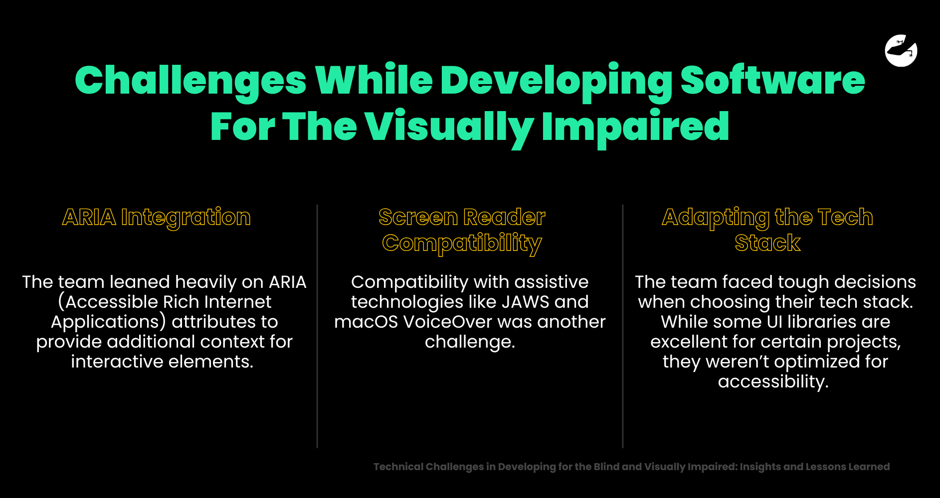
The team leaned heavily on ARIA (Accessible Rich Internet Applications) attributes to provide additional context for interactive elements.
For instance, adding ARIA labels to buttons and links ensures screen readers can convey their function, like "submit form" or "return to homepage.
2. Screen Reader Compatibility
Compatibility with assistive technologies like JAWS and macOS VoiceOver was another challenge. While the designs technically met accessibility guidelines, real-world testing revealed that some elements didn’t behave as expected.
For instance, buttons might be readable but didn’t indicate when they had been clicked, leaving users in the dark about whether their actions were successful. Resolving these issues required close collaboration between developers and designers.
Note: Completely blind individuals navigate the site using the assistance of JAWS, a popular paid screen reader for Windows, and macOS’s built-in VoiceOver.
3. Adapting the Tech Stack
The team faced tough decisions when choosing their tech stack. While popular UI libraries like Ant Design were excellent for certain projects, they weren’t optimized for accessibility.
Instead, the team opted for ShadCN, a customizable UI library, to build accessible components. Unlike some other libraries, ShadCN offered the flexibility needed to tailor components to accessibility standards.
Tailwind CSS further streamlined the styling process, while Storybook allowed for isolated testing of individual components.
Collaboration and Communication: The Secret to Success
Accessibility isn’t just a design or development task—it’s a collaborative effort that thrives on clear communication and shared goals.
The team adopted a proactive approach, staying one sprint (2 weeks) ahead in their workflow. Designers would finalize and test accessibility features 2 weeks before developers began implementation. This lead time allowed for thorough reviews, discussions, and adjustments.
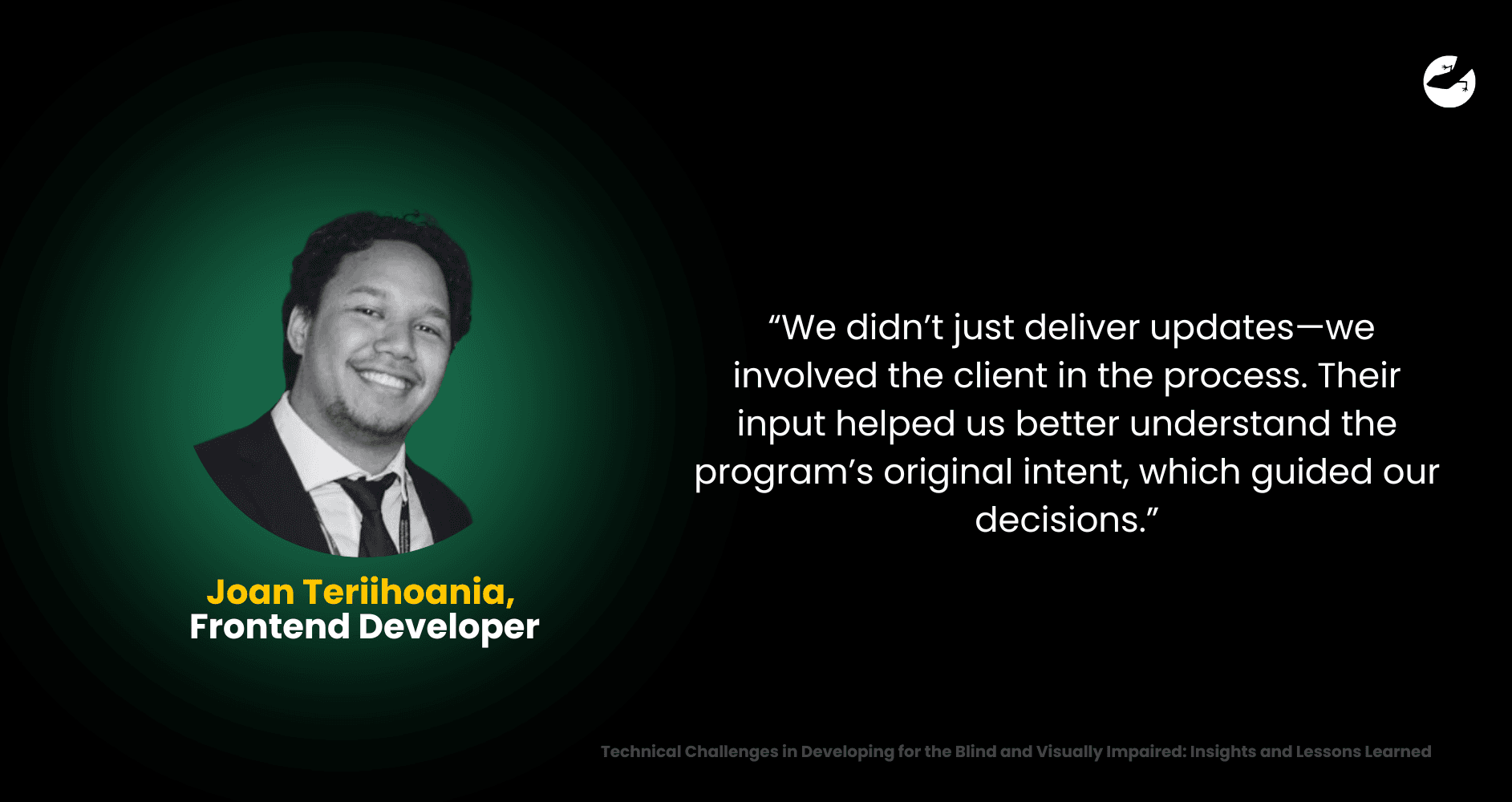
Open lines of communication with the client also proved invaluable. “We didn’t just deliver updates—we involved the client in the process,” Joan, one of the developers, explained. “Their input helped us better understand the program’s original intent, which guided our decisions.”
The collaboration didn’t stop there. Regular internal discussions kept everyone on the same page, ensuring that the design and development teams worked in harmony. These conversations fostered trust—not only within the team but also with the client, paving the way for future development phases.
Lessons Learned and Best Practices
The journey of making technology accessible to visually impaired users brought invaluable lessons that reshaped how the team approached design and development. These lessons extend beyond accessibility and serve as guiding principles for creating inclusive and user-centered digital products.
1. Start Small: Build, Learn, and Grow
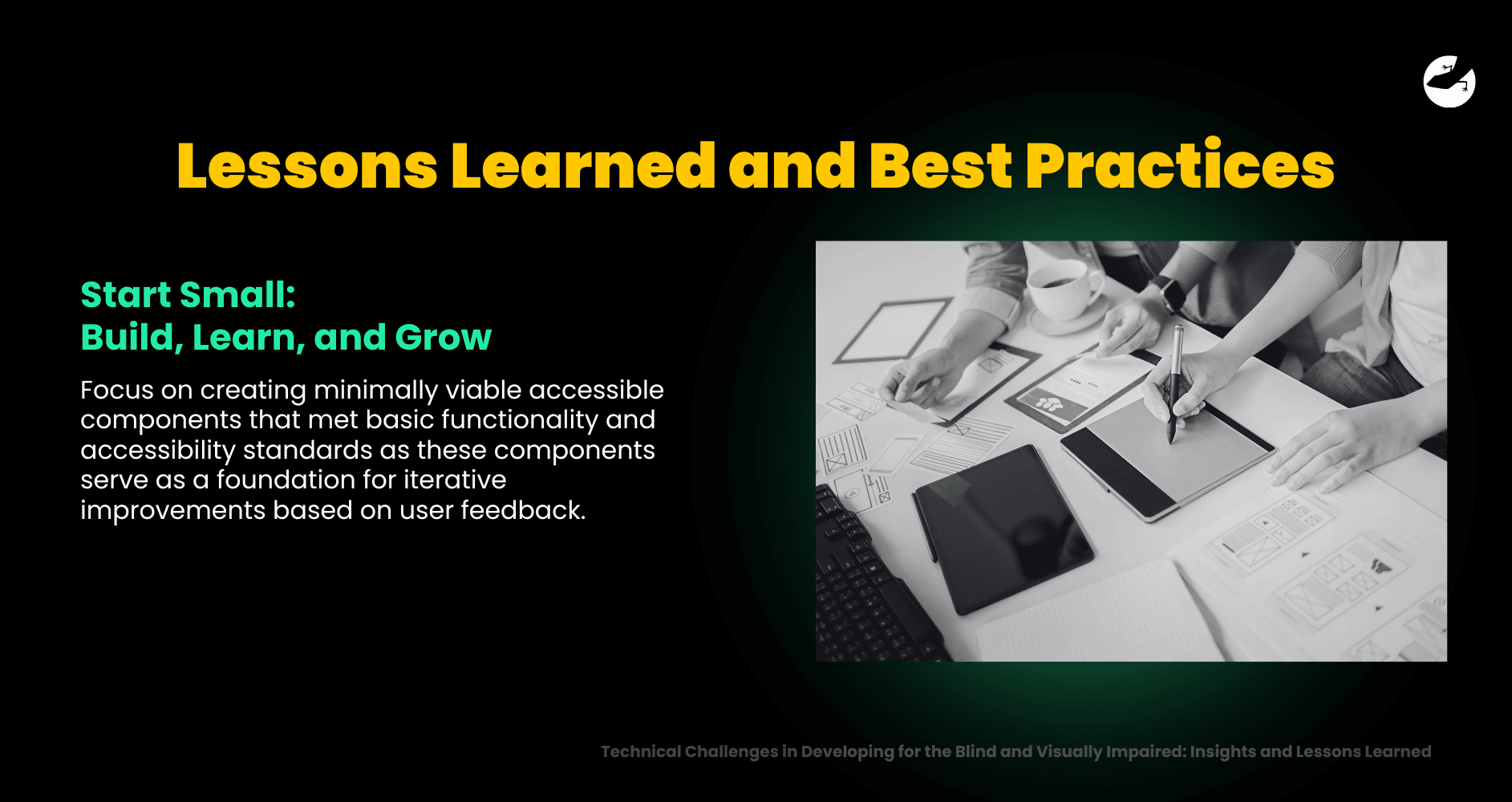
One of the most crucial insights was the power of starting small. Instead of striving for perfection from day one, the team focused on creating minimally viable accessible components that met basic functionality and accessibility standards. These components served as a foundation for iterative improvements based on user feedback.
This "build-and-learn" approach proved invaluable. For example, early prototypes revealed issues that only became apparent during real-world testing. By starting small and remaining flexible, the team could quickly adapt, refine, and improve their solutions without wasting time or resources.
Eric, the lead designer, summed it up perfectly: "Start with the essentials. Speak to your users, listen to their needs, and then build upon that foundation. Accessibility is an ongoing journey, not a one-time achievement."
2. Test Early and Often: Validate Accessibility in Real-World Scenarios
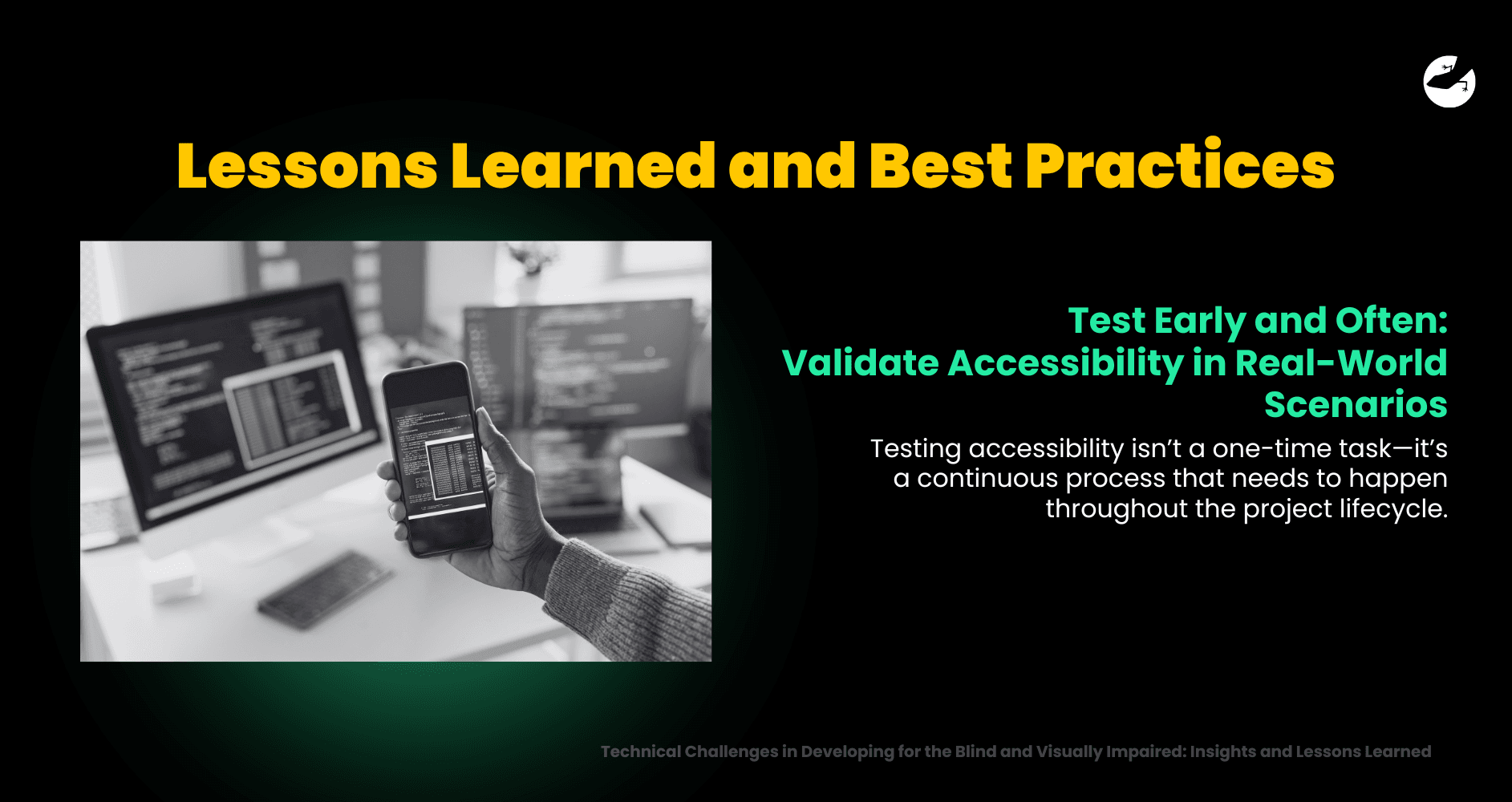
The team learned that testing accessibility isn’t a one-time task—it’s a continuous process that needs to happen throughout the project lifecycle. By simulating real-world scenarios using tools like JAWS (a paid screen reader) and VoiceOver (macOS’s built-in screen reader), they uncovered usability issues that wouldn’t have been visible through visual design reviews alone.
For example, during testing, the team discovered that while certain buttons looked accessible on the surface, they didn’t provide enough feedback for screen reader users. Adjusting ARIA attributes and ensuring proper focus management resolved the issue, but it highlighted the importance of validating assumptions early.
By testing early and often, the team minimized costly revisions down the line and ensured the final product worked seamlessly for its intended audience.
3. Leverage Resources: Make the Most of Accessibility Tools and Standards
Designing for accessibility doesn’t have to feel overwhelming, thanks to the abundance of tools and resources available. For the team, the WCAG (Web Content Accessibility Guidelines) served as their guiding framework, offering a clear and structured approach to accessible design.
In addition, Figma’s accessibility plugins became an indispensable part of the workflow. These plugins allowed the team to test for color contrast, font size, and overall legibility right from the design phase. They even used accessibility simulators to experience their designs as a visually impaired user would, revealing gaps that might have gone unnoticed.
Learning to utilize these tools effectively turned what initially felt like a daunting challenge into an achievable goal. The team also gained confidence that these skills would carry over to future projects, regardless of whether accessibility was explicitly required.
4. Prioritize Collaboration: Open Communication Leads to Success
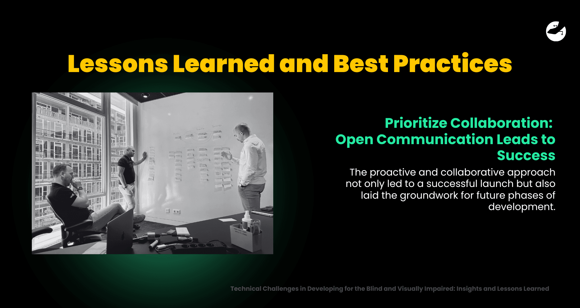
The project underscored the importance of collaboration at every stage. Designers, developers, and clients worked closely together to ensure the platform met both technical requirements and user needs.
One of the key strategies was staying one sprint (2 weeks) ahead of development. This allowed the design team to finalize and test accessibility features well in advance, leaving room for discussion and iteration. Frequent reviews and open communication built trust between the team and the client, ensuring everyone remained aligned on goals and priorities.
This proactive and collaborative approach not only led to a successful launch but also laid the groundwork for future phases of development. As Joan, a developer on the team, noted, “Clear communication wasn’t just about solving problems—it built trust, which made everything else easier.”
5. Accessibility Benefits Everyone: A Win-Win Outcome
Perhaps the most surprising lesson was how building for accessibility improved the platform for all users, not just those with visual impairments. Accessibility features like clear navigation, keyboard shortcuts, and semantic HTML made the platform more intuitive and user-friendly for everyone.
From a technical perspective, prioritizing accessibility also resulted in cleaner, more structured code, which made the platform easier to maintain and scale. The team found that focusing on inclusive design principles didn’t just solve problems for visually impaired users—it enhanced the overall user experience. This realization reinforced the idea that accessibility isn’t just a niche concern; it’s a cornerstone of good design and development.
By embracing these lessons, the team not only delivered an accessible and inclusive platform but also set a standard for how they would approach future projects. These best practices serve as a roadmap for anyone looking to create technology that truly empowers users, regardless of their abilities.
The Reward: A Truly Inclusive Platform
After a few months of effort, the final product was more than just a functional platform —it was a solution that empowered its users. For visually impaired individuals, the platform offered independence and ease of use.
Users praised the platform for its intuitive navigation and attention to detail, especially in areas like keyboard shortcuts and screen reader compatibility. For the team, this validation was the ultimate reward. “Hearing users say, ‘This works for me,’ was the highlight of the entire project,” Eric shared.
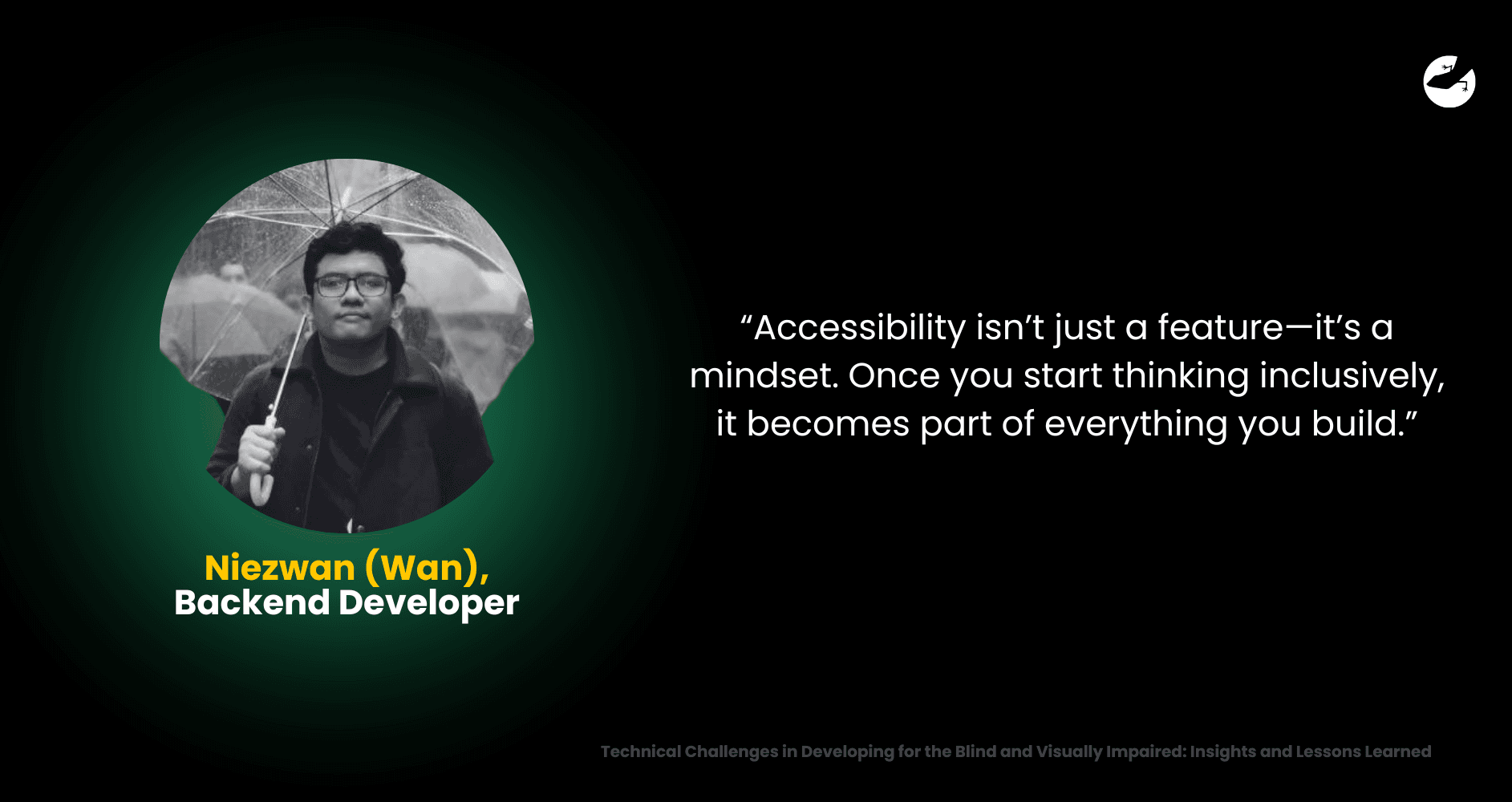
Beyond the user feedback, the team took pride in their growth. They’d gained skills and insights that would inform their future projects, even those that didn’t explicitly require accessibility. As Wan put it, “Accessibility isn’t just a feature—it’s a mindset. Once you start thinking inclusively, it becomes part of everything you build.”
Lizard Global: Your Partner in Accessibility Innovation
At Lizard Global, we believe inclusivity and innovation go hand in hand. This project reinforced our commitment to creating technology that works for everyone, regardless of their abilities.

Whether you’re launching a new platform or reimagining an existing one, we’ll work with you to ensure your product is inclusive, functional, and future-proof. By partnering with us, you’re not just meeting accessibility requirements—you’re creating experiences that leave no one behind.


