Top 5 UI/UX Design Hacks For Increasing Conversions
Get the latest updates about our blog posts.
Subscribe so you don’t miss out!
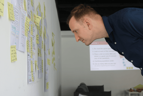
Professional UI/UX designers know exactly what tricks to use to provide a better experience for their users, as well as stimulating them to perform certain actions. Focussing on specific design elements, playing with colors, shapes, and sizes, and placements, they can steer your visitors towards subscribing to your mailing list or getting into contact with you for an appointment. With a slight touch of a shadow in a corner or adding a popping red CTA button, UI/UX designers can increase your conversions like it’s magic. Often, designers implement analytical tools, such as Hotjar, to track what users are clicking on and hovering over. Based on the outcomes of the analytics, they can create data-driven design implementations to increase conversions. This blog already gives you a little insight into five UI/UX design hacks that help you understand the basics of increasing conversion through smart design.
1. Highlight First and Last
Research within the field of psychology has observed that people often focus their attention on the first and last item of a series. This phenomenon is called the “serial-position effect”, and can highly influence the way website visitors experience your site. A UI/UX designer can, for example, place certain buttons or other functionalities in the far left or far right side of your screen. That’s why, for example, the button to sign in or register is so often placed in one of the upper corners of a website or application. It automatically draws the attention of visitors, instead of being “swallowed” up by content in the middle of a webpage.
2. Popping CTA Buttons
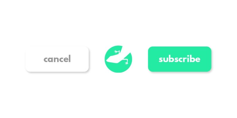
When you’re creating buttons on your website for Call To Actions with a double choice, such as “subscribe” and “cancel”, it can be beneficial to put more emphasis on the choice you want your visitors to make. In this case, that would be the “subscribe” button. Instead of creating a sense of disbalance by making one button bigger than the other, you can do it in a way more subtle way. By entirely removing the colour from the “negative” CTA button, you automatically and subtly shift the focus to the button you want your visitors to click on, without it being too obvious. You often see this in cookie bars, requesting visitors to accept the cookies on that website. The “OK” or “Accept All” buttons are always visually more prevalent since the negative button is usually washed out or decolored. This way, they greatly increase the chance of visitors accepting their cookie terms.
3. Streamline the Experience
In our blog about UI/UX design you can read about the interplay between the user interface and the user experience, and how designers make sure that both of them are perfectly aligned with one another. In order to increase the overall experience of your website visitors, you want to streamline the way they behave and move through your website, smoothly steering them from point A to point B and C, and so forth.
First, you have to find out how your users will interact with your design, as well as defining how you want them to behave. The best way to do this is by testing interactive prototypes or clickable demos. This way, you can track exactly how your end-users move through your website, find out what buttons they click and why, shift your focus to the design elements that matter most for streamlining the overall user experience of your site.
4. Less is More
People like simplicity. The more options and trigger points your website contains, the more difficult it becomes for users to smoothly navigate through your site. Imagine stumbling upon a site, and somewhere on that site is the information you’re looking for, but a whirlwind of buttons, links, menus, images, and other content makes it completely impossible to find the information you need. So, building upon the process of streamlining the experience of your users, taking away all unnecessary elements from your site can greatly improve the overall experience of your visitors.
You really don’t need four different buttons sending visitors to your “about” page. One single strategically positioned button is enough for users to find their way to the page they’re looking for. If you want to make sure your visitors can indeed find what they’re searching for, implement a search bar into your site, and the problem is solved.
5. Implement a Responsive Design
A responsive design makes sure that your audience can access and interact with your site on different devices with different screen sizes. This way, you broaden your audience by focusing on all visitors. No matter what device they use, the design is optimized for any screen, which makes it more likely for a visitor to stay on your site for a longer time. Thus, implementing a responsive design can greatly contribute to the number of people who access your site, as well as increase the time they spend on your website.
Need a hand?
Our experienced UI/UX designers are more than happy to lend you a hand with the design of your website. Do you already have a design, but do you need some improvements? Or are you starting from scratch? It doesn’t matter. Our team gladly dives into the unique character of your business to create a design that doesn’t only run smoothly, but are also tailored to the uniqueness of you and your organization. We provide you with a UI/UX Consultancy session, as well as the actual creation of your new design. Get in touch!